Brand and Website Design for Odds + Ends Creative

I'm so excited to finally share a peek behind the branding for Odds + Ends! Launching this business has been a side project of mine for over a year, so I thought it'd be cool to walk you through the full branding and web design process. As a designer, it's hard to give yourself the same process as you would for clients. For Odds + Ends, I really tried to be as intentional and structured as I would be with a client. It was definitely a challenge, but in the end it turned out exactly as I had envisioned!
INSPIRATION
If you got a chance to read about why I started Odds + Ends, you'll know that a large part of me felt limited by the voice I could use as a fine art photographer. I knew a lot of people blend in all of their abilities under one umbrella, but that would've meant a deviation from my target photography client. I wanted to teach and be entirely authentic to the voice I could use as a teacher to a variety of creatives, not just other photographers. So when I began looking at my brand identity for this new project, I wanted it to be bright, fun, and edgy-feminine. If you know me, this is pretty much me to my core. I feel deeply, share openly, dream big, am straight-up opinionated, and have a bit of a potty mouth *whoops*. I wanted Odds + Ends to be a visually engaging experience for other girl bosses who identify with those things and HUSTLE HARD.

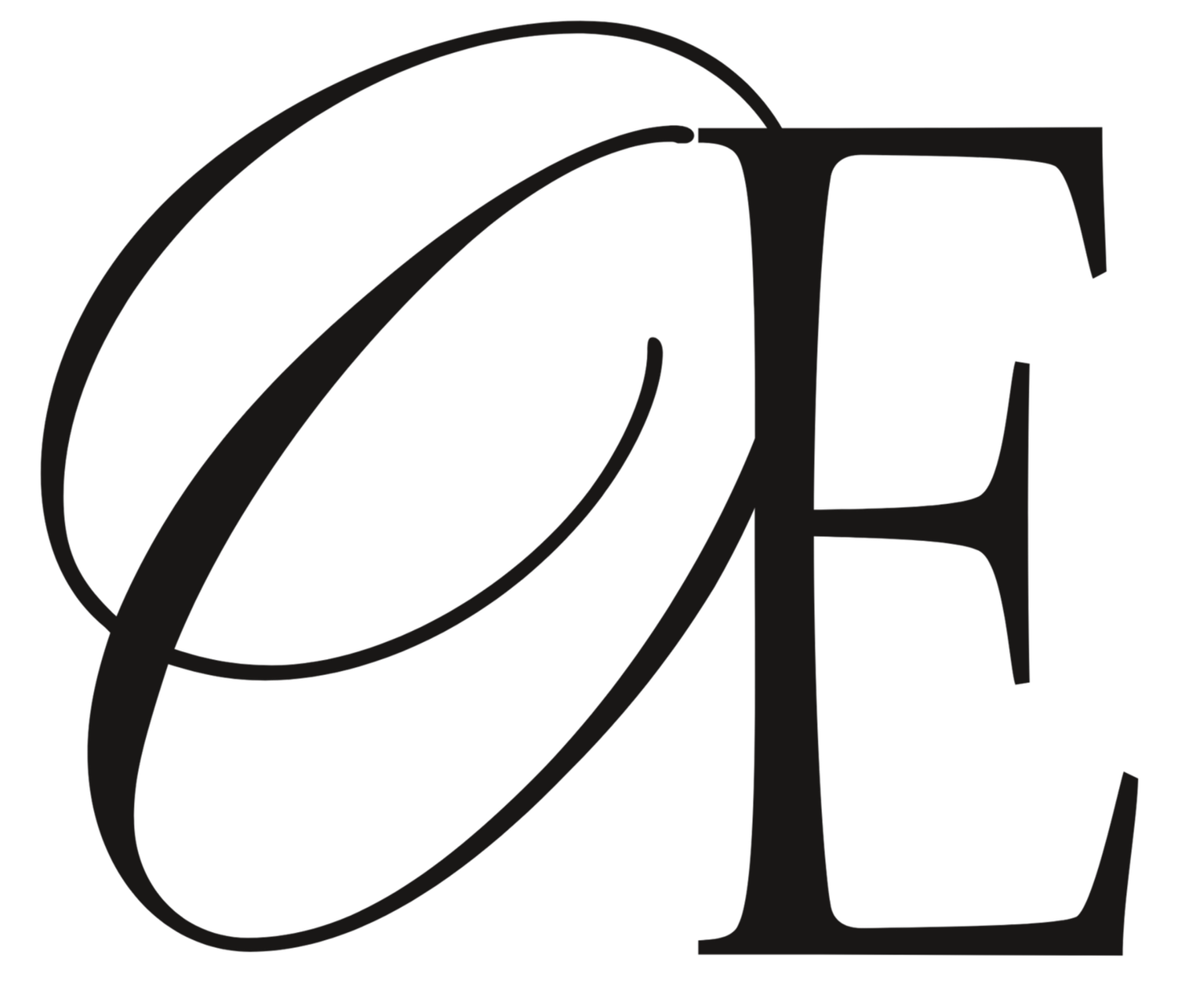
THE LOGO
My logo was probably the most difficult part of the whole branding process. After debating whether I wanted it to be hand-written or digital lettering, I drafted up some rough sample concepts to play with. I go through the same process with client work, although for clients I deliver five draft logos.

I, of course, went for a modified version of Logo #4. I love how it clearly suggests digging beneath the surface, which is the whole purpose of Odds + Ends Creative! It's a lot more sleek and refined than the other options as well, which works well for my target market.
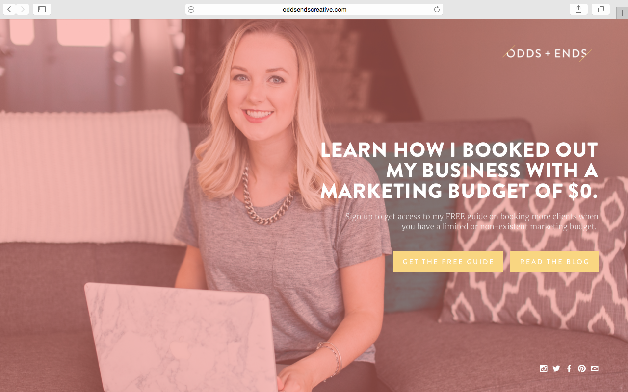
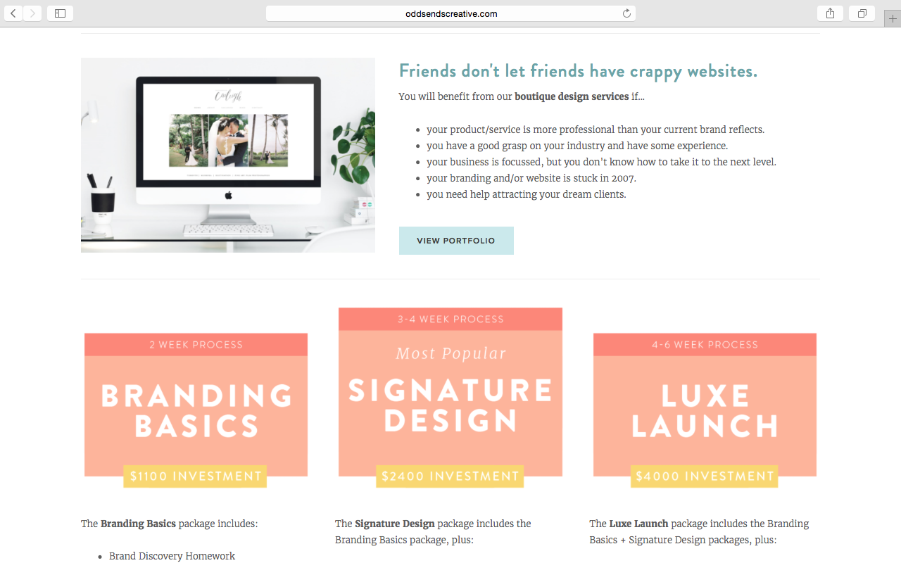
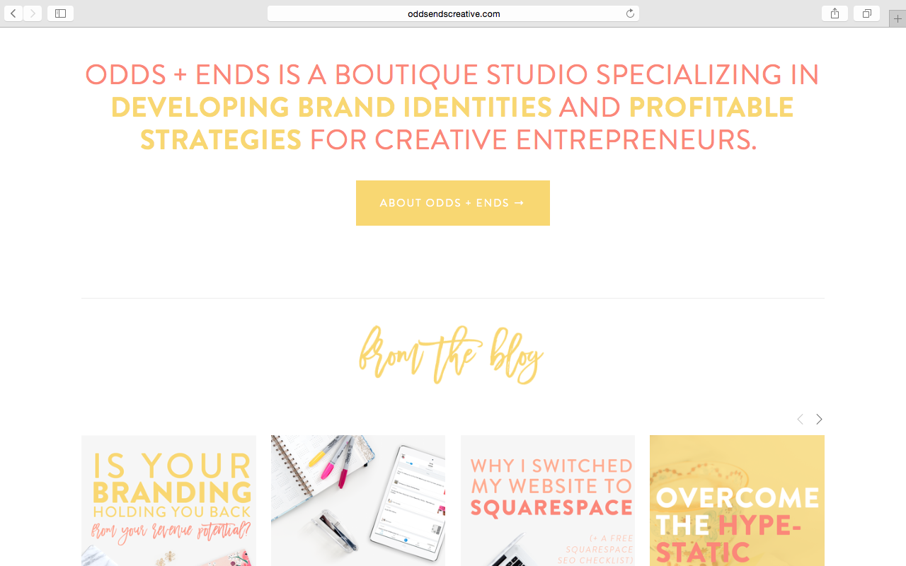
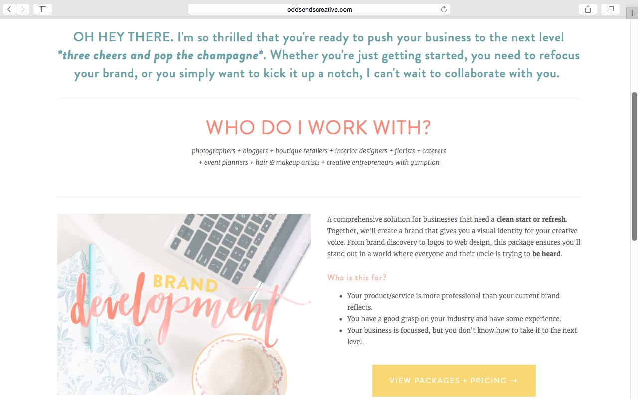
THE WEBSITE
My website is my main hub for readers and potential clients to get a sense of what I do and what I'm all about. I built this website using the Squarespace platform, with custom graphics and CSS additions by yours truly.
Read Post: Why I Switched My Website to Squarespace (+ Free SEO Checklist)
All of my social media point back to my blog and sales pages, so those were my main focus. My biggest priority upon launching was to encourage email list growth, which is why I opted for a landing page for my home page and infused content upgrades + newsletter links throughout my site.

My biggest design priorities for any web project are:
- Communicate value proposition throughout.
- Consistent brand values communication.
- BADASS VISUALS. Enough said.
- Logical target client & reader onboarding.
- User-friendly design and seamless flow.
- Goal-oriented strategic content.
I hope you've enjoyed this look into my branding and web design process! If this is something you think would be a great fit for your business, feel free to check out my packages:
ABOUT THE AUTHOR
Thanks for dropping by! I'm Caileigh and I create killer brand identities and offer coaching for creative entrepreneurs with gumption. When I'm not helping people build profitable businesses, I document love stories as a fine art film photographer.
Connect with me on Facebook, Instagram, Twitter, & Pinterest.


